Shop millions of independent artists. Independent. Together.


Tacoma, WA
$260.00
Title
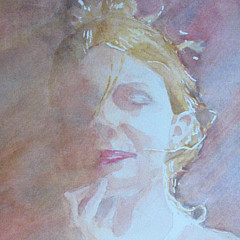
Out Of The Darkness
Artist
Ken Powers
Medium
Painting - Watercolor On Paper
Description
I wanted to maintain a bit of a looser feel with this piece while experimenting with a very dark background. The background is a German Vine Black mixed with a Prussian blue and it creates a great backdrop to really up the contrast of the brightly lit petals of the flower. I used Rublev, Winsor & Newton, and Daniel Smith watercolor paints on Arches 140# cold-pressed paper. The original is 9.75"x13.75" in size.
Uploaded
July 20th, 2011
Statistics
Viewed 6,978 Times - Last Visitor from New York, NY on 04/24/2024 at 10:44 PM
Embed
Sales Sheet
Crisfield, MD - United States
I think you may have outdone yourself on this one, Ken! The dark background and the white of your lights really make this one stand out - beautiful!
Newberry, Fl - United States
The dark background and contrasting light tones is very effective. Lovely piece, Ken!
Zeeland, MI - United States
Really like this one Ken, again, I am enjoying the more roundedness of this piece.
Ken Powers replied:
Thank you Sandra! I had fun creating more contours to the internal petal shapes.
Arcadia, MO - United States
Stunning -- one of your best, if not your best watercolor, Ken.
Ken Powers replied:
Thank you Kip! I think it might be my best one as well. It will be tough to top this one for me!
Petrolia, On - Canada
This is almost 3-D Ken! The contrasts are fantastic and, as Marsha said, this more than pops!
Covington, Oh - United States
This one more than pops....it's exploding! Wow....such a vibrant piece. I love it, right down to the little pink bud.
Ken Powers replied:
Thank you Marsha! I really wanted to try something with an extremely dark background.
Remington, VA - United States
Ken I like the loose look of the flower and using the dark bacgrownd was a good thing. I love the flower


Please Wait...
Sign up for our newsletter for exclusive deals, discount codes, and more.


Server Status OK
Copyright © 2024 Licensing.Pixels.com - All Rights Reserved


Share
Comment, Like, Favorite
0
0
0
0
0
4
5
13